| « Video of growing ice spike | The cup and the butterfly » |
The end of snow
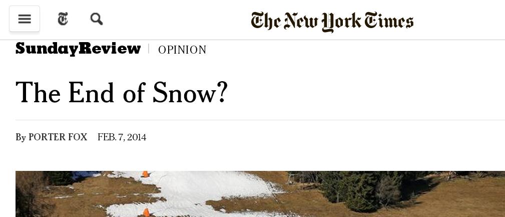
This recent front-page article caught my eye:
The writer is an avid skier-snowboarder, and thus concerned about the future of his sport. The facts he relates paints a grim picture:
- In the past 47 years, a million square miles of spring snowcover has disappeared from the Northern Hemisphere.
- Since 1970, the winter warming-rate has been triple the rate of the previous 75 years.
- The Alps are warming 2-3 times faster than the world-wide average.
- Potential Winter Olympic venues shrinks from 19 (now) to 6 by 2100.
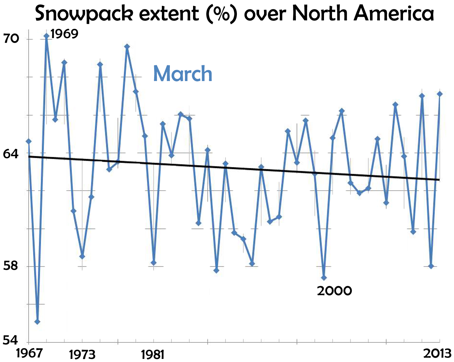
and many other facts. Avid skiers like spring skiing. For March, the data (from Rutgers University Global Snow Lab) show a decline in area covered by snow.
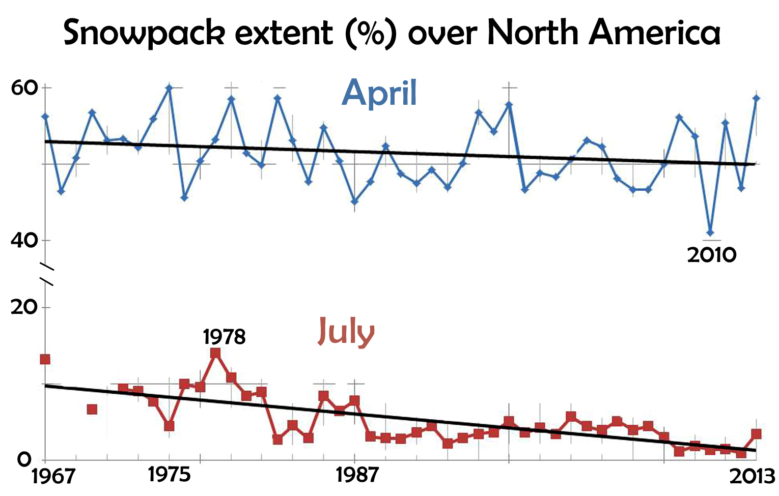
Later in spring, as well as summer, the declines continue:
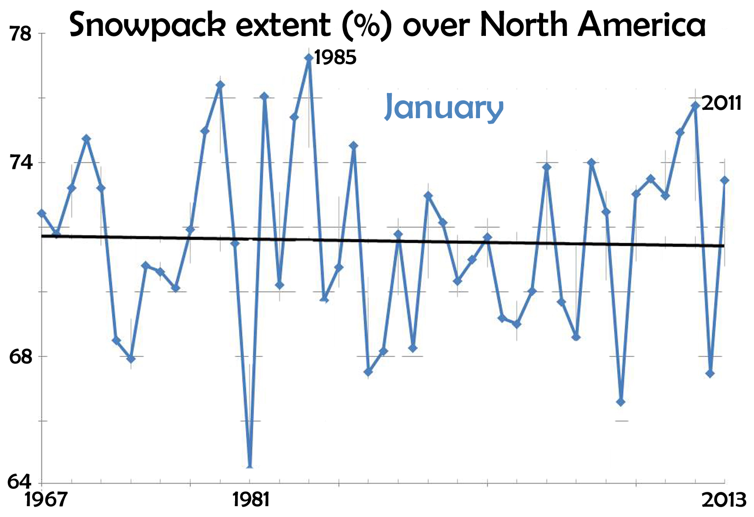
The rate of decline is highest for July. In midwinter, the decline is only slight:
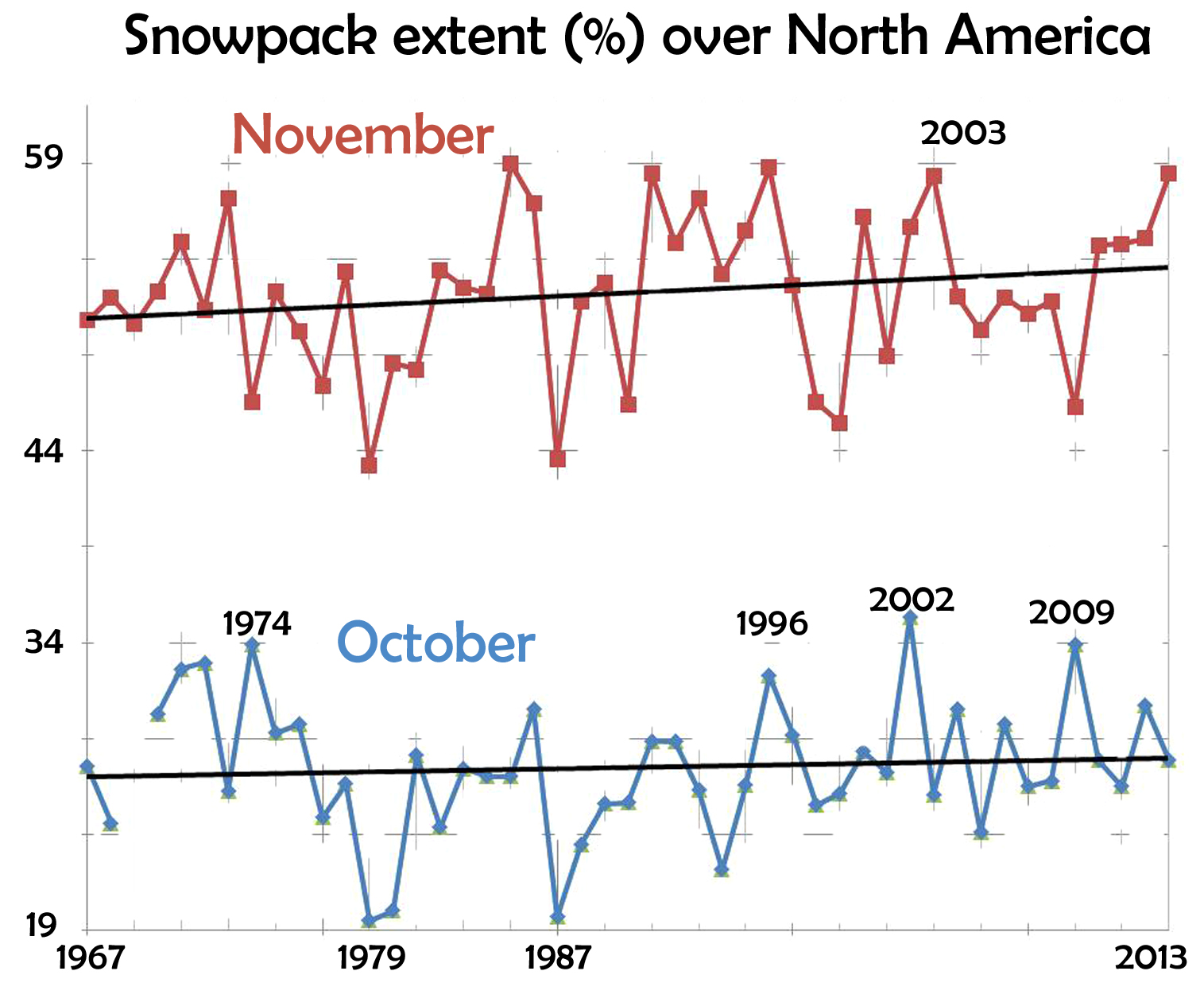
But in fall, the snowpack actually increases:
For a skier though, the increase in October and November may not completely compensate for the decrease in March, seeing as their actual coverage values may be too low for many ski areas to open. This may explain the declining number of ski areas mentioned in the article.
Of course, the areal extent of the snow is not exactly the snow amount. But, at least in many mountain areas, the total amounts of water falling as snow have steadily declined. So, overall, and on average, there does seem to less snow for skier-snowboarders now than before. Hopefully though, things are not as dire as the headline suggested.
Other recent articles suggest similar outlooks for sled-doggers and ice-skaters. I recently wrote about the declining number of frost-days and ice-days. Another way of looking at all of this is that ice and snow are becoming more precious.
- JN
1 comment

Looking at this posting, now 7 years after I wrote it, it might look like the plots are from the NY Times article. They aren’t. I spent quite a bit of time making them.
My point was that if one looks at the data, the picture is not as grim as the newspaper articles suggests. Also, note that the snow coverage instead has an increasing trend in the early winter. Also, obviously, the trends in smaller regions may be quite different than those of all of N. America, as I plotted here.
03/21/21 @ 22:56
